Designs
T-Shirt and other merch designs. All sorts of styles, all sorts of methods.


A Perfect Circle - Outsider
This was one of the first pieces I developed for APC. At the time I told my wife it was the best design I've ever made. There are times when a personal favorite that gets ignored, and then there are times when your opinion is shared. Thankfully it was the latter. The band loved it. It was used as promotional material for the spring 2017 tour. Between March and November of 2017 I got to make 5 18"x24" screenprint posters, several original designs, and have had my pieces used for advertising on the Spring and Fall 2017 tours.

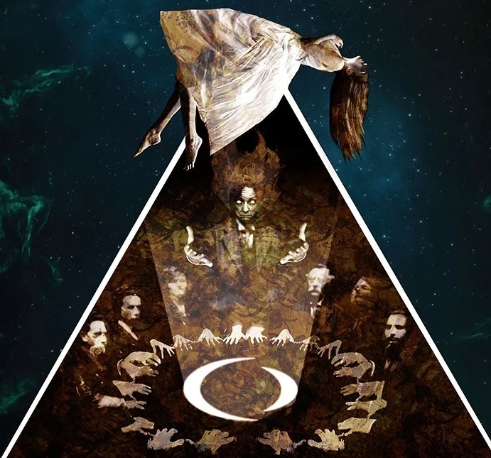
A Perfect Circle - Surrender to Gravity
A second piece in the style of Outsider was requested and this is what I came up with. The seed of the idea comes from a spiritualist from Winnipeg who danced out her seances on top of a table. The pictures were heavily modified, even the floater herself was made of three different photographs. This is a modified version that was created to advertise the Fall 2017 tour.

A Perfect Circle - Ornate Spirit Board
Elements of my Screenprint poster and odds and ends from original drawings were combined to create this tee for the Fall 2017 tour. Unlike the poster this is a traditional Ouija format, with the symbols spelling out the alphabet.

Slayer - Haunting 84 Flier
This started with one of those ancient scans of someones photocopied flier collection. The swords cross out proprietary information and phone numbers to protect the "innocent." Other elements were added as needed. One of a series.

Ghost - VIP Spirit Board
There are several Ouija inspired pieces in my portfolio. This one was the first. The imagery is from the Popestar album package. When I was in LA in October I got to see this in person. It's remarkably beautiful, the board is wooden (not cardboard) and the planchette (a metal art Deco Papa Emeritus head with a magnifying lens in the center) is nice and heavy and really completes the package. VIP items should be unique and special because people have paid alot for them. This piece was certainly special.

Ghost - Papa Cash
The band handed out fake money at their concerts and we got a hold of some to make tees and posters with it. We got a great file from the band and I recombined the elements to make the best print possible. Some of the element cutting was a tough but it was a really fun project.

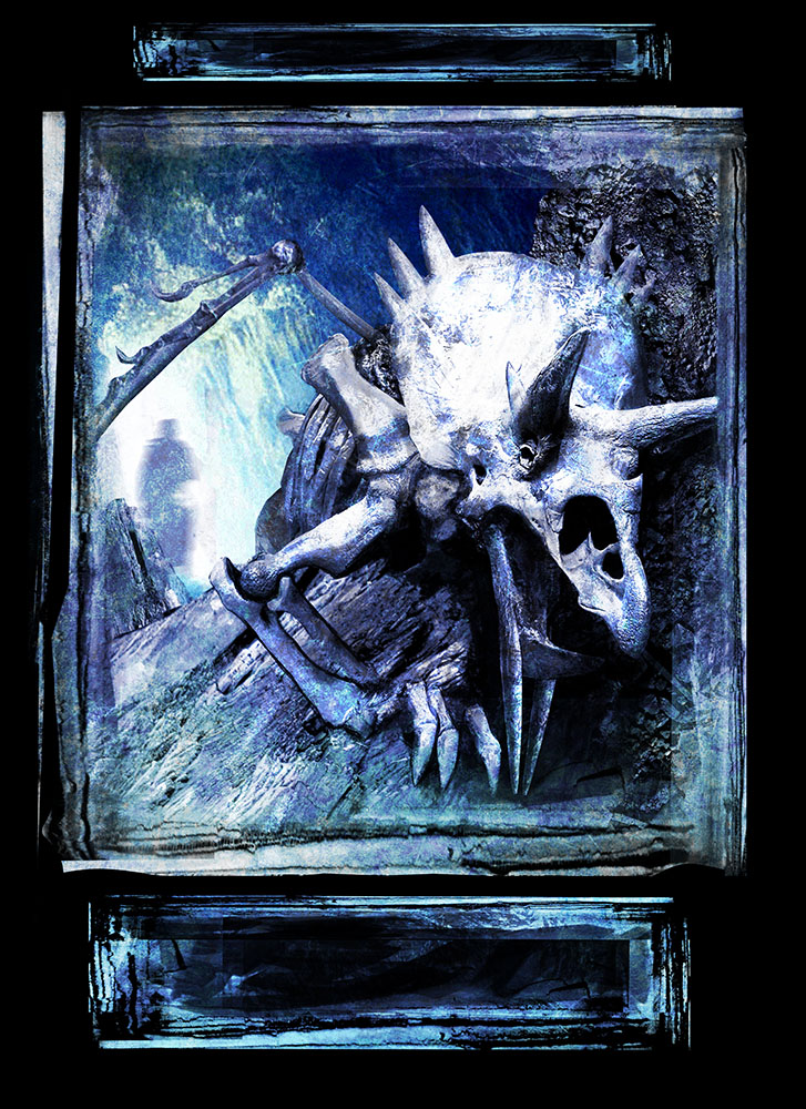
Demonic Dinosaur - Excavation
"What if the Devil put a Dinosaur in the earth?" That was the challenge from the band, a pitch of sorts. Calling this a photo montage is totally misleading, this is a painting using realistic textures and chopped up photos and painted embellishments. All of my design work uses painting skills, what comes forward, what goes back, make sure the lighting is convincing, make sure the anatomy is viable enough to not raise questions.

Demonic Dinosaur Fossil - Discovery
Always submit a second concept. It's a good rule of thumb and really suits me. There's also the lingering sense that profile images are a cop-out. It's absurd because a well designed profile is every bit as, if not more. challenging than a three quarter view. Expedition might be more iconic, but Discovery has implied narrative, which is something I always like to include.

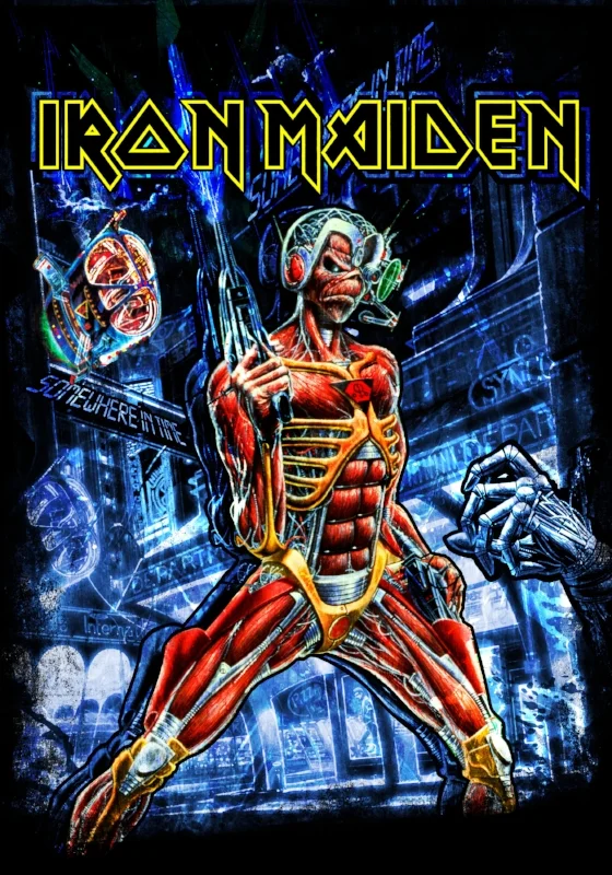
Iron Maiden - Graphic Somewherein Time
Reworking great original art is a big thing when you work with Maiden. I always loved Derek Riggs' original cover for Somewhere in Time. 90's cyberpunk influences abound in how I reworked the background and logo.

Iron Maiden - Vampyr
New background and format for this classic piece. At the time the band was switching things up and concentrating on post 1990 artwork. The original piece is very wide and the eddie bat has it's wings spread more. I popped the colors and zoomed in on that great face, moved in the wings to up to ominous feel. As with most Derek Riggs Maiden pieces the art was already great, the goal was to show it in a new way.

Machine Head - King of Diamonds
The original sketch was created by Rafal "too many skulls" Wechterowicz. The band wanted to see my take on it and this is the result. The original pencil and graphite "shavings" drawing was scanned and duplicated and frankensteined together. The band was very happy with the final results. A stage backdrop, bass drum head, and of course t-shirts were created.

Machine Head - Death Tarot
The King of Diamonds style carried on through a series of Tarot Card Designs. The first three were Death, The High Priestess, and The Devil. A record store day vinyl release used all three as variant covers. Of Rider-Waite tarot deck iconography was a heavy inspiration.

Machine Head - The High Priestess
The symbology of the Rider-Waite tarot deck was followed pretty much to the letter on this one.

Rival Sons - Wolf
They had a beautifully painted album cover that didn't have anywhere near enough contrast to print well on a t-shirt. Adjustments were made, elements modified, a back leg and tail were added to the wolves to make it all work out as the band wanted. This is a common challenge in merchandising.

Alice Cooper - Silent Fiend
We were developing a line for the Alice Cooper "Raise the Dead" tour. This was my favorite piece from the line but it fell into that "Approved but never used" catagory. The original image was from his Welcome to my Nightmare 2 album. The phantom of the opera feel of the inlay photo was hard to beat.

Alice Cooper - The Dead Rise
You ever wake up one day and find it shocking that you haven't done some extremely specific thing that's right in your wheelhouse? I'm not sure how I made it to 40 without drawing Zombies rising from the grave? Every once in a great while you get lucky enough to check a box on your creative bucket list on the same day you realize it should be on there. Bonus points if you get paid to do it, and if they make an 18x24 metal sign with that piece, that's kind of a grand slam!

Slayer - Invasion
I've made six original pieces of artwork for Slayer (many more designs, but I'm talking about original drawings). They all beat the hell out of you. This one was made into a skateboard, t-shirts, and a one page wall calendar. When I went to the "Big Four" concert at Yankee Stadium in 2013 Kerry King wore it. I never knew if he did it because he knew I was in the audience. Someone might have told him. As a result it was in the New York times write up on the concert, a publication of some renown. A strange life for a piece I hoped my Mother in Law would never see.

Motley Crue - Feelgood Lyrics
I saw this tour back in 1989 and got to work on their Final Tour fifteen years later.

Carolina Revellion 2012 event tee
I'm not the most graphic and simple designer but I do love minimalism and vinyl record label inspired designs are a favorite.

